Introduction: Where Creativity Meets Color Science
Whether you’re designing a brand, painting a masterpiece, or redecorating a room, color isn’t just decoration — it’s communication. But navigating the endless spectrum of hues can feel overwhelming. That’s where the Creative Color Wheel comes in.
It’s more than red, yellow, and blue arranged in a circle. It’s a visual tool that allows artists and designers to tap into emotional storytelling, establish visual balance, and bring bold ideas to life. It fuses classic color theory with creative freedom — your personal compass in the vast universe of design.
In this guide, we’ll explore how the creative color wheel works, how to use it effectively, and how it can elevate your creative process from ordinary to exceptional.
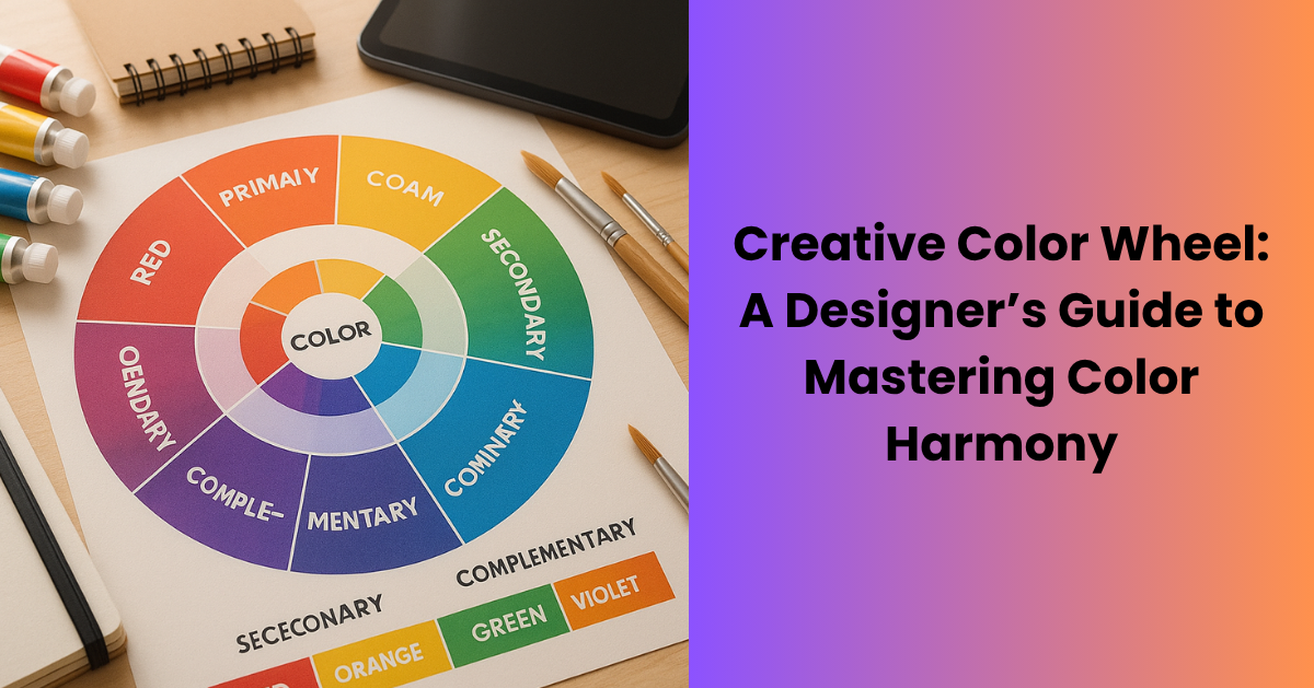
What Is a Creative Color Wheel?
The creative color wheel is an evolved version of the traditional wheel. While it still displays primary, secondary, and tertiary colors, it goes further by integrating tools for:
- Tints, shades, and tones
- Warm vs. cool psychology
- Analogous and complementary color harmony
- Emotional color mapping
- Experimental palettes for digital and print designs
It’s widely used by:
- Graphic and UI/UX designers
- Artists and illustrators
- Interior decorators
- Teachers and students
- DIY crafters and creatives
The creative color wheel doesn’t just show which colors pair well. It teaches you why they do — and how to adapt them for bold, expressive outcomes.
Why Use a Creative Color Wheel?
-
Master Visual Harmony
Avoid clashing colors and create balanced, eye-catching designs with the color wheel.
Pro Tip: Use triadic or split-complementary schemes for layouts that are both bold and cohesive. -
Evoke Emotions
Colors communicate feelings—red for urgency or passion, blue for calm or melancholy. The creative color wheel helps you choose hues that match the emotional tone you want to convey. -
Build Brand or Project Consistency
Whether you’re designing a logo or decorating a space, the wheel helps you stick to a consistent color story while still exploring creatively. -
Save Time on Design Choices
Skip the trial and error. The color wheel offers a quick, reliable system for selecting palettes and accents—cutting down on design time without sacrificing quality.
How to Interpret a Creative Color Wheel
A well-designed creative color wheel typically includes:
- Primary Colors: Red, yellow, blue
- Secondary Colors: Orange, green, violet
- Tertiary Colors: Blends like red-orange, blue-green
- Tints: Color + white
- Shades: Color + black
- Tones: Color + gray
Advanced wheels may also feature:
- Warm vs. cool segments
- Complementary and analogous guides
- Mood or energy indicators (e.g., calming, energizing)
Applying a Creative Color Wheel in Real Projects
-
Graphic Design & Branding
Create a palette that’s visually cohesive and emotionally aligned with your brand by using the color wheel to define:-
A strong primary color
-
Matching accent tones
-
Effective call-to-action (CTA) contrasts
Try This: Use a split-complementary palette for web designs—it offers visual balance and energy without overwhelming the viewer.
-
-
Painting & Illustration
Artists rely on the color wheel to build depth, contrast, and emotion in their work:-
Use analogous colors for calm, serene scenes
-
Use complementary pairs (e.g., blue and orange) to emphasize focal points
🔗 Explore the Kids’ Color Wheel to see how beginners learn foundational color theory interactively.
-
-
Interior Design & Home Projects
Apply the wheel to coordinate colors across walls, furniture, and decor:-
Use tetradic combinations (two complementary pairs) to create bold, balanced interiors
-
Ensure visual flow and harmony throughout your space
-
Experimenting with Color Schemes
Color wheels make creative experimentation simple and satisfying. Try these classic schemes:
- Monochromatic: One hue with varying lightness and saturation. Elegant and minimalist.
- Complementary: Opposite colors on the wheel. Bold and high contrast.
- Analogous: Side-by-side hues. Smooth, cohesive, and peaceful.
- Triadic: Three evenly spaced colors. Vibrant and well-balanced.
- Tetradic (Double Complementary): Two complementary pairs. Diverse and dynamic.
🔗 Try our Color Wheel Spinner — a great tool to generate random color combinations and bust creative blocks.
Teaching Creativity with Color
The creative color wheel is also a powerful educational resource. Parents and teachers use it to:
- Teach warm vs. cool color perception
- Show how color mixing works
- Spark hands-on projects that blend logic and imagination
🔗 Read our Color Wheel for Kids Guide — inspire future artists through play-based learning.
Creative Ways to Use the Wheel
Looking for fun, offbeat ways to make the most of your color wheel? Try these:
- Instagram Planning: Design a cohesive feed using a palette
- Mood Boards: Set the emotional tone before you even begin
- Craft Projects: Choose yarns, paints, or scrapbook elements that match
- Personal Style: Coordinate outfits that match your mood or season
- Marketing: Use psychologically driven colors to boost engagement
Helpful Tools to Support Your Color Flow
You don’t need to rely on just physical wheels. Try these free online tools:
- Adobe Color – Professional palette creation
- Canva Color Wheel – Simple, drag-and-drop wheel for beginners
- Coolors – Fast palette generation with export options
Bonus Tool: Use our interactive king of wands yes or no to randomly choose elements like fonts, styles, or themes!
Final Thoughts: Color Is Your Creative Superpower
The creative color wheel isn’t just a chart — it’s your muse, mentor, and guide. Whether you’re sketching, designing, decorating, or teaching, it empowers you to work with intention, confidence, and flair.
So the next time you’re stuck staring at a blank screen or canvas, don’t stress. Spin your wheel. Play with combinations. Break a rule or two. Because when you understand color, you unlock a language that speaks to the heart, the eyes, and the imagination.
Frequently Asked Questions (FAQs)
1. What is a creative color wheel, and how is it different from a traditional one?
A creative color wheel expands on the basic primary, secondary, and tertiary color model by including emotional color cues, warm vs. cool segments, tints, shades, and tones. It’s tailored for designers and creatives who want to go beyond matching colors — it helps tell visual stories with intent.
2. Who should use a creative color wheel?
Graphic designers, artists, illustrators, interior decorators, teachers, students, and DIY crafters all benefit from using a creative color wheel. It’s perfect for anyone seeking to create color harmony, consistency, or emotional impact in visual projects.
3. How can the creative color wheel help me design better?
It helps you avoid color clashes, select emotionally appropriate hues, save time on palette decisions, and maintain visual consistency. Whether you’re working on a brand, website, painting, or room design, it provides a structured path to creative freedom.
4. What are some popular color schemes I can create with the wheel?
Common and effective schemes include:
-
Monochromatic: One hue with variations
-
Complementary: Opposites on the wheel
-
Analogous: Neighboring hues
-
Triadic: Three evenly spaced colors
-
Tetradic: Two complementary pairs
5. Can beginners use the creative color wheel?
Absolutely. Beginners can start with basic schemes like analogous or complementary colors, then experiment with more complex combinations. 🔗 Explore our Color Wheel for Kids for an engaging introduction to color theory.
6. How does color affect emotion in design?
Each color evokes different feelings. For example:
-
Red = passion, urgency
-
Blue = calm, trust
-
Yellow = happiness, energy
Using the color wheel helps align these emotions with your project’s tone.
7. Are there digital tools that support the creative color wheel?
Yes! Some top tools include:
-
Adobe Color – Professional palette building
-
Canva Color Wheel – Great for beginners
-
Coolors – Fast, AI-powered palette generation
-
🔗 Try our Color Wheel Spinner to explore combinations interactively.
8. How do I use the color wheel in interior design?
Use it to balance wall colors with furniture and decor. Try tetradic palettes for bold results or analogous schemes for calming environments. It helps ensure every room feels intentional and cohesive.
9. What’s the difference between tints, shades, and tones on the color wheel?
-
Tints = Color + white
-
Shades = Color + black
-
Tones = Color + gray
These variations help add depth and mood to your designs.
10. Can the creative color wheel help with branding and marketing?
Yes. Brands use it to craft consistent color stories and emotional messaging. For example, blue builds trust (popular in tech), while red draws attention (great for CTAs). It ensures color choices are strategic, not random.