Introduction: Color Isn’t Just Visual—It’s Emotional
Consider the last time you were utterly captivated by a work of art, a brand’s Instagram account, or the snug vibe of a cafe. Most likely, the reason wasn’t simply what you were looking at—but how it made you feel.
Colors evoke emotion. They establish moods. They inform decisions.
As creatives—be you a graphic designer, artist, photographer, interior designer, or content creator—your affair with color is paramount.
And that’s where the creative color wheel is your best ally. Not merely a circle with lovely colors, but a breathing tool that allows you to feel your way into a successful design.
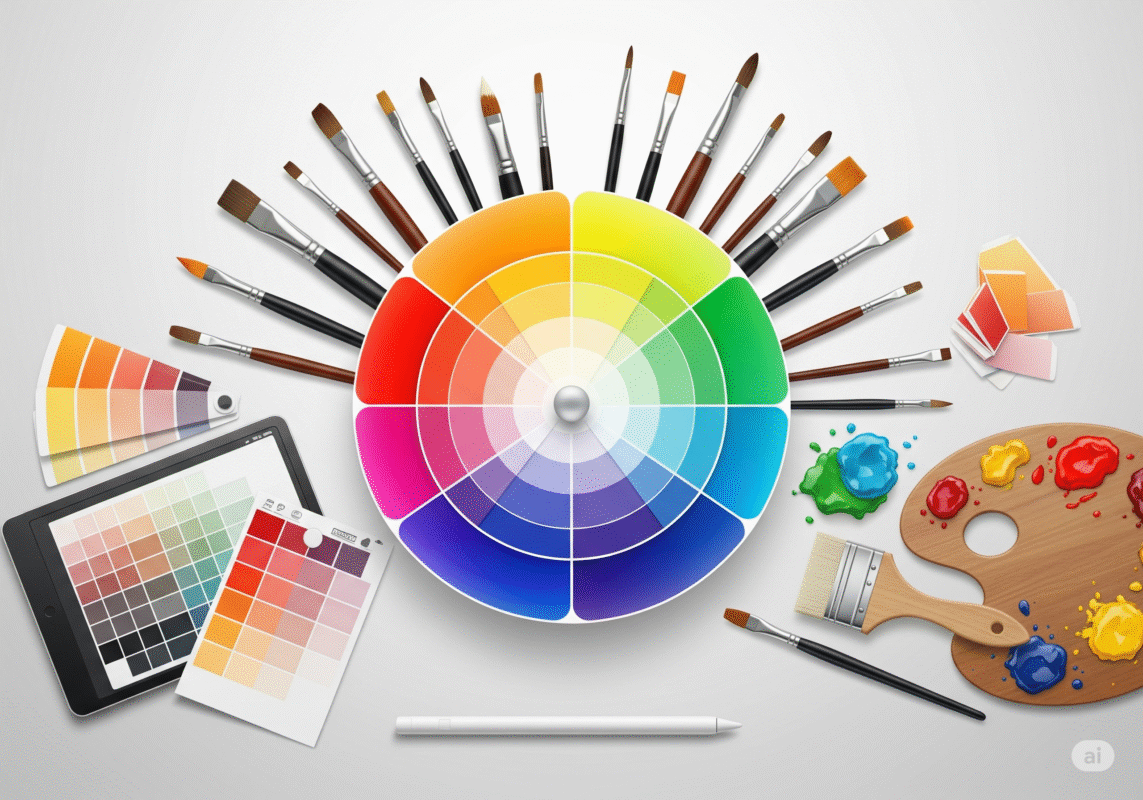
What Is the Creative Color Wheel, Really?
At its essence, the creative color wheel is a visual mapping of colors in order of their chromatic relationship. Consider it a map that guides you through what colors work together, fight each other, or mesmerize.
As opposed to a standard color wheel taught in grade school art classes, the creative wheel gets more in-depth:
- It involves the inclusion of shades, tones, and tints
- Includes color psychology uses
- Provides flexibility for exploratory palettes
- It’s applied to ignite emotion-based design choices
The genius of the creative color wheel is in how dynamic it is. It’s no longer a static tool—it adapts with your taste, your brand image, or the emotional mood of your project.
The Psychology of Color: Why It Matters in Design
Before we even get into mixing up color combinations, it’s worth knowing this:
Color isn’t viewed—it’s perceived.
| Color | Emotional Trigger |
|---|---|
| Red | Passion, urgency, excitement |
| Blue | Calm, trust, professionalism |
| Yellow | Optimism, energy, cheerfulness |
| Green | Balance, growth, peace |
| Purple | Luxury, mystery, creativity |
| Black | Sophistication, power, elegance |
| White | Simplicity, purity, space |
The choice of color impacts how others react to your work—visually and emotionally. It determines clicks, purchasing decisions, first impressions, and even recall.
In a busy visual world, emotionally intelligent design is the key to making your work stand out. That begins with color.
Primary, Secondary & Tertiary Colors—Quick Refresher
You can’t harmonize without playing the right notes. Let’s cover the fundamentals:
Primary Colors
Red, Blue, Yellow
These are the foundation stones—every other hue is derived from them.
Secondary Colors
Orange, Green, Purple
Produced through a combination of primary colors.
Tertiary Colors
Red-Orange, Blue-Green, Yellow-Purple, etc.
A mix of primary and secondary colors, providing depth and variety.
Bonus Tip:
Most artful color wheels will also display tints (color + white), shades (color + black), and tones (color + gray). These modified counterparts assist you in making balance and hierarchy.
How to Use the Creative Color Wheel Like a Pro
1. Complementary Colors
These are opposite each other on the wheel—blue and orange.
Ideal for high-contrast images, such as logos or call-to-action buttons.
Use it when you need something to pop.
2. Analogous Colors
These are side by side on the wheel—red, orange, and yellow.
They create a harmonious, pleasing color palette—often seen in nature.
Apply it to landscapes, lifestyle branding, or soft product designs.
3. Triadic Colors
These create an equilateral triangle on the wheel—red, yellow, and blue.
You achieve intense visual contrast while having balance.
Lovely for fun brands or energetic editorial designs.
4. Split Complementary
Choose a base color, followed by its two neighboring complements—blue, with yellow-orange and red-orange.
Less powerful than full complementary but equally high-impact.
Use this for more subtle drama in digital content or video.
5. Monochromatic
Different tints and shades of a single color.
Minimal, elegant, and cohesive.
Perfect for fashion, UI design, or portfolios.
Real-Life Creative Uses of the Color Wheel
Filmmaking
Wes Anderson is a genius with color harmony. Ever noticed how he uses split complementary palettes for emotional undertones?
Photography
Color wheel strategies inform outfit choice, background hue, and edit filters for visual narrative.
Fine Art
Van Gogh and Matisse employed complementary and triadic color harmonies to inspire emotion.
Branding & Social Media
The more intentional your color, the more emotive your work.
Think of brands like Spotify (green + black) or Fanta (orange + purple)—intentional, striking color pairs that linger in your mind.
Pro Tips for Working with the Creative Color Wheel
- Restrict your palette. Too many colors overwhelm the eye.
- Employ contrast for hierarchy. Call attention to CTAs or key design elements.
- Balance warm and cool tones. Warm = action and energy; Cool = calm and space.
- Test on real screens or print. Colors can look different in practice.
- Trust your gut. If a color feels bad, it likely is.
Pro Tip:
Blind-test color pairs with friends or customers. You’ll receive genuine emotional feedback—without them even knowing what’s motivating the response.
Tools That Assist You in Implementing the Creative Color Wheel
Here are some free and paid tools that apply color theory in innovative ways:
| Tool | What It Does |
|---|---|
| Adobe Color | Make color schemes with color wheel rules |
| Coolors.co | Create palettes immediately—ideal for branding |
| Canva Color Wheel | Easy-to-use, interactive interface |
| Paletton | Advanced color visualizer with adjustable settings |
| Color Hunt | Palettes curated with trendy inspiration |
These resources help you translate theory into practical design decisions in seconds.
Conclusion: Creativity Starts with Color
The creative color wheel is not just a tool—it’s a dialogue between you and your audience. It allows you to communicate what you cannot with words. It enables you to create feelings, stimulate thinking, and impose order upon randomness.
Once you understand color relationships, you stop guessing. You begin to design with intention. And that’s when your work transforms from “okay” to unforgettable.
So whether you’re sketching your next masterpiece, designing a mobile app, developing your personal brand, or simply selecting a paint color—don’t forget to spin the wheel.
Your ideal color combination is waiting.
Try This
Open Adobe Color or Coolors today. Input your go-to color and discover harmonies you may never have imagined.
Let color guide you. Creativity will follow.